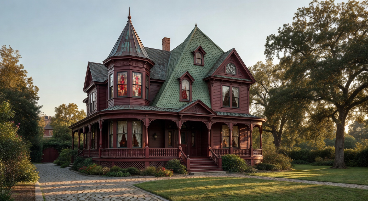
Ever stepped into a house that feels like it’s winking at you? That’s the magic of Queen Anne asymmetry, a hallmark of late 19th-century architecture that turns symmetry’s rigid rules on their head. Unlike the balanced facades of Georgian homes, Queen Anne style revels in delightful imbalance—towers sprouting unevenly, windows staggered like mischievous eyes, porches wrapping around one side only. This playful distortion isn’t chaos; it’s intentional whimsy, born from a Victorian-era rebellion against classical perfection.
Picture the style’s origins in 1870s England, where architect Richard Norman Shaw drew from Tudor cottages and medieval half-timbering, infusing them with industrial-age flair. Queen Anne quickly crossed the Atlantic, exploding in America during the 1880s “Queen Anne Revival.” Why “Queen Anne”? It evoked the elegance of the real Queen Anne’s reign (1702-1714), though the style borrowed more from her era’s eclectic tastes than strict historical accuracy. Builders slathered on ornamentation: textured shingles, spindlework friezes, and cutaway bays that jut out asymmetrically, creating dynamic silhouettes against the sky. Front-facing gables often featured decorative vergeboards, while one dominant chimney or turret commanded attention, pulling the eye off-center.
Key features amplify this off-kilter vibe. The hallmark is the asymmetrical massing—think a tall corner tower paired with a lower wing, or a wraparound veranda that hugs just half the facade. Steep, multi-pitched roofs clash angles for visual drama, often clad in fish-scale shingles or diamond patterns. Entryways hide under hooded porches, flanked by mismatched windows: tall narrow ones next to wide picture frames, some with leaded glass for extra sparkle. Colors pop too—originally unpainted brick or clapboard got bold palettes of mustard yellows, olive greens, and terracotta reds, making each house a neighborhood showstopper.
Fast-forward to today, and Queen Anne asymmetry thrives in modern revivals. San Francisco’s Painted Ladies—those iconic row houses—draw tourists daily with their candy-colored asymmetry. Contemporary architects nod to it in “New Urbanism” projects, like Marysville, Washington’s Victorian-inspired neighborhoods, blending historic charm with energy-efficient updates. Even minimalist designers borrow the motif: Frank Lloyd Wright echoed it in his “Butterfly Wing” houses, proving asymmetry’s timeless edge.
Why does it matter now? In our era of cookie-cutter suburbs and algorithm-driven sameness, Queen Anne asymmetry reminds us that beauty blooms in imperfection. It celebrates individuality, much like today’s push for diverse, personalized spaces. These homes foster creativity—owners endlessly tinker with turrets and trim, turning houses into living art. Environmentally, their varied roofs capture sunlight better for solar panels, and compact footprints suit urban density. More than nostalgia, this style whispers that true character defies straight lines, inviting us to embrace the beautifully crooked in architecture and life.
(Word count: 448)
Comments are closed